According to the Fortune Business insights report, the Global Data Visualization Market will reach USD 19.20 billion by 2027, growing at a CAGR of 10.2%. The growth is primarily driven by enterprises wanting to invest more in data visualization tools. Nowadays, businesses have become increasingly dependent on data to support decision-making at all levels of the organization, and the challenge is to interpret data quickly and effectively. This is when BI Dashboards come into play. BI dashboards help executives interpret data instantly. Over the past few years, BI dashboards have become increasingly popular due to their ability to provide a concise visual representation of real-time data.
BI Dashboards: A Modern Business Intelligence Tool that Maximizes Productivity
Business Intelligence Dashboards are indispensable for businesses trying to make sense of complex data. It reduces human involvement by accessing, analyzing, displaying, and sharing data via web-based dashboards, leveraging modern BI platforms. Dashboards allow stakeholders to build reports that can be reviewed, analyzed, and acted upon with the help of a powerful, automated business intelligence tool.
The Benefits of BI Dashboards can be extended to:
- Communicating business-critical information quickly
- Tracking and implementing KPIs
- Determining market trends
- Allowing users to gain access to information
- Attaining data-driven decision-making
- Enabling trusted and verified data sharing
- Intuitive reporting and analysis
- Enhancing efficiency and visibility of business processes
A Walkthrough Microsoft Use Case
Power BI is an important component of Microsoft’s Power Platform which is fast emerging as a low-code platform of choice for customers trying to make sense of their data and trigger actions based on data.
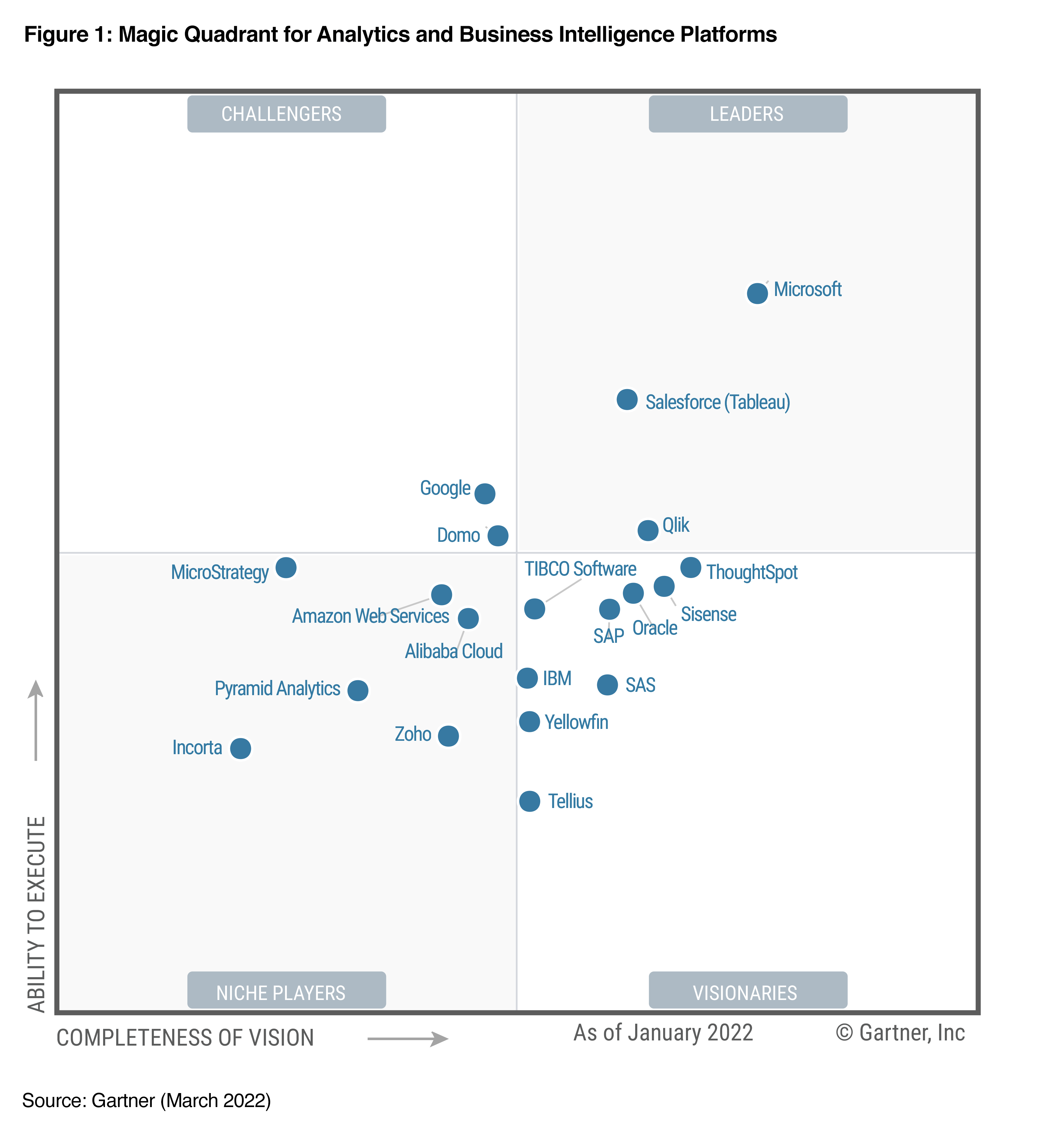
Gartner has acknowledged Microsoft as a Magic Quadrant Leader in business intelligence and analytics platforms because of the Power BI platform's capabilities. Microsoft is once again ranked best in its ability to execute and the farthest in the completeness of vision for the fourth consecutive year.
Organizations leverage Power BI to analyze data in various scenarios. Let us look at some common use cases:
- A Top-Level Executive uses it to visualize the organization's profitability.
- A sales manager uses Power BI Dashboards to assess the effectiveness of his sales representatives.
- A digital marketer uses it to determine the success of his social media campaigns.
Customer Success Story – Power BI
Hendrick Motorsports, an American professional auto racing organization, aimed at gathering a significant amount of data but couldn’t find a way to mine it for performance advantages and insights. After understanding the popularity of Power BI and how businesses are taking advantage, Hendrick Motorsports deployed Power BI to speed up the time to insights and make data more available to every employee. The organization could concentrate on building the most aerodynamic cars and enabling the swift pit crews in the nation by putting data at the center of the operation.
The Demand for BI Dashboards Will Boost Organizations' Decision-Making Capabilities
According to Fortune Business Insights, the global business intelligence market is expected to reach $43.03 billion in 2028 from $24.05 billion in 2021, at a CAGR of 8.7%. Though there are various factors, such as rising investments in analytics, an increase in cloud adoption and data generation, and a growing focus on digital transformation, the primary factor contributing to the evolution of the Business Intelligence market is the rising demand for dashboards. By enabling data collection, consolidation, analysis, and meaningful visualization, BI dashboards assist business users in making more informed decisions.
The Top 5 BI Dashboards Best Practices according to Corinna Adkins:
1. Identify What Your Requirements Are
Dashboards for business intelligence are designed to help users find data-driven solutions to pressing business issues. A dashboard's priority is to deliver data that resolves a query from beginning to end. Consequently, your first step should be to decide what data you need to display on the dashboard to accomplish this. When designing BI Dashboards, ask yourself a few questions, such as:
- Why do you need this dashboard?
- What issue are you attempting to resolve?
- What information is required for a decision?
- How will viewers access the dashboard?
- Which metrics should be highlighted in particular?
- What reports are already available?
- What action should you take based on these insights?
These questions will provide a framework and enable you to zero in on particular facets of your performance, which is when KPIs enter the picture. Key performance indicators (KPIs) are valuable tools that may be used to monitor the growth of your business. You may see and evaluate data pertaining to your KPI targets using BI dashboards. Select the metrics that best reflect the current state of your business and measure the progress towards your goals.
2. Consider Your Audience
The finest dashboards begin with the intended audience in mind. Answer the following question while keeping your target audience in mind:
- Question: What would make this dashboard successful for your audience?
- Answer: You should consider your audience's unique requirements while developing your dashboard. If you are unfamiliar with your audience, you might want to start by considering their priorities.
Let's take some examples -
- Investors and executives want to view dashboards that summarize KPIs over time to make data-driven business choices for the future.
- The marketing division wants to see dashboards that compile metrics for calculating the ROI of marketing efforts.
Personalizing dashboards tailored to a different audience is integral to shaping business efforts and success.
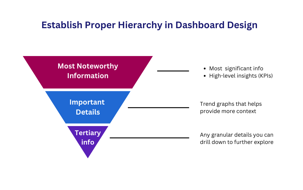
3.Accentuate Critical Information
A dashboard is a visual representation of data. Just like a writer pens down the most valuable information in the first paragraph of their article, a dashboard should work similarly by highlighting the most relevant insights first. Ironically, the inverted pyramid, a concept that originated in journalism, is a valuable one to follow. Here's how:
- Put the most important and substantial information first,
- Followed by crucial details that aid in understanding,
- And finally, detailed background data allows a reader to delve even deeper
A dashboard should sift through the clutter and immediately present the user with the most critical information to save the customer time.
4. Right Visualization of Data is Important
Visualizations should have a clear purpose and be more successful at communicating information than in a tabular format. To better understand how the visualization should be displayed, it is vital to consider the information that must be shared.Four different categories of information are typically displayed via data visualizations:
5. Add Interactivity
Interactive dashboards are increasingly gaining traction and have become the preferred method for presenting information, replacing dull presentations and confusing analyst reports. It's because, in today's digital age, interactivity is critical to delivering insights.
Create dynamic dashboards that users may customize to suit their preferences. On the dashboard, users should be able to quickly see the general picture before effortlessly drilling down to some essential details.
The following are some of the top interactive dashboard options to think about:
- Click-to-filter to analyze data
- Various charts can use a time interval widget to boost specific time scales
- Zoom option for charts
- Charts can be displayed or hidden - a great feature for quickly combining and visualizing several datasets
Power Automate visuals empower end-users to gain insight and turn them into action. Further, End users can execute an automated flow entirely within a Power BI report using the Power Automate visual. The flow being conducted may be data contextual, which means that the inputs to the flow may change depending on the user-defined filters.
Customer Success Story - How Softura Developed Real-Time Dashboards, Leveraging Microsoft's Power BI Data Visualization And Analytics Tool
One of the world's largest ink manufacturers required a bespoke representation of their machine layout to monitor equipment on their floor. They needed visibility into how their machines were operating to reduce downtime. Utilizing Microsoft's Power BI analytics and data visualization technology, Softura created real-time dashboards. By doing so, Softura helped the customer:
- Import and prepare custom visuals into a one-stop shop custom tool so that company employees know precisely how each machine performs on the floor.
- The solution also gave the ability to react instantly to machine failures.
- Also, the customer could gain real-time visibility into any potential issues that were likely to occur.
Stay Ahead of the Curve with BI Dashboards
In today's world, Business Intelligence dashboards are real-time interactive solutions that facilitate decision-making. The above mentioned best practices for BI dashboards allow businesses to unlock the full potential of BI software solutions. If you’re looking for a BI solution having powerful data visualization capabilities that can build dashboards, Softura is your way to go. We are a Microsoft Certified Gold Partner for Power BI services and enable well-informed business decisions with accurate business analysis and data visualizations. We have proven expertise in developing agile, interactive, and customized dashboards that can be quickly delivered across any device.